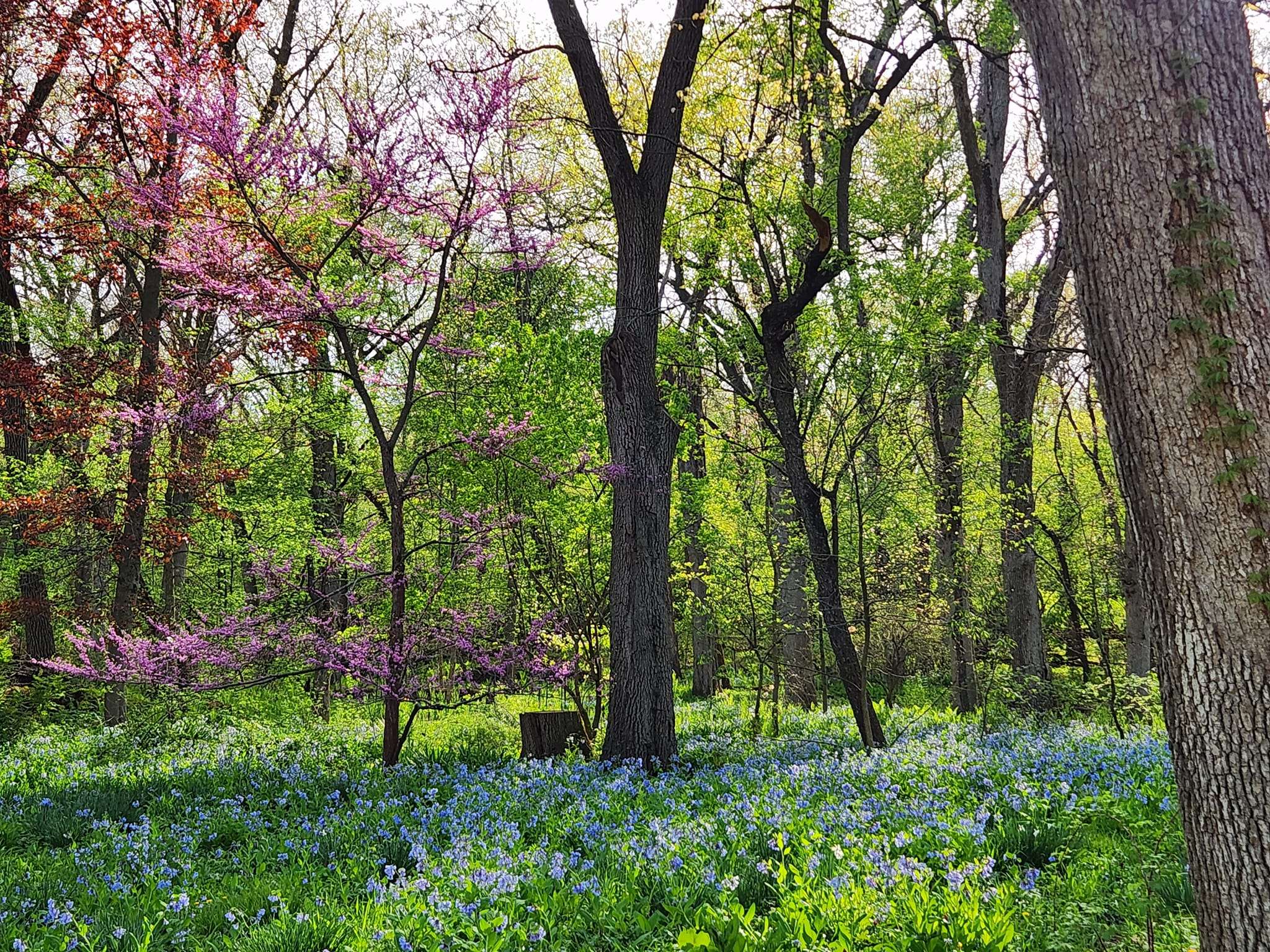
The Wildflower Preservation and Propagation Committee
  • Home
  • About Us
  • Programs
    • Upcoming Events
    • Natural Landscape Seminar
    • Native Plant Sale
    • Garden Walks
    • Garden Mentoring
    • Outdoor Classrooms
  • Blog
  • Gallery
  • Resources
    • Natural Landscape Seminar 2020 Resources
    • Books
    • Garden Mapping Project
    • Garden Plans
    • Native Plant and Service Providers
    • Rain Garden How To
  • Contact Us

This is an example of a full width text box on a page that is set to use a Right Sidebar. Like the full width page, any row type/division/element can be used, but it will be sized into the reduced size content area because of the right side bar.

This sidebar on this page is set to “Page Sidebar”
There is also a “Blog Sidebar”, but that is used exclusively on the Blog page.


The lines above and below are horizontal lines inserted from the text area by clicking on the “Horizontal Line” icon in the typography bar.


You can add a photo (or photos) as you would in a word processor. To wrap around the photo(s), click the photo and click on the left (or right) edge icon.

Format Headings with Heading 1 (2, 3, 4, 5, 6 — all descending in type size)

Format paragraph text with size, color, bold, italic.
Bullet points can be added from the typography bar above — just click on the bulleted list icon. Bullet lines must be separated by a hard return (enter) to start another bullet

  • first bullet
  • second bullet
  • third bullet

Don’t try to put multiple line breaks or space bar spacings — they won’t work.
Only a hard return (enter) for a paragraph break or to break a style setting (such as here H4 returns to paragraph setting when ‘enter’ is hit).

A soft return (shift-enter) will keep lines closer and continue the style settings. (such as returning to paragraph style, here)


The above is an example of a divider set to 100% width, 2px, and using a theme color  #aac44e,
It’s a great way to divide content. This text is an additional text box beneath it added for tutorial only.

This is an example of a row split into 1/2 + 1/2.

You can place any type of content in either side. For this example, the left side contains an image (sized to large), the right side is a text box.

Events Calendar

Loading view.
  • March 2023

Calendar of Events

S Sun

M Mon

T Tue

W Wed

T Thu

F Fri

S Sat

0 events, 26

0 events, 27

0 events, 28

0 events, 1

0 events, 2

0 events, 3

0 events, 4

0 events, 5

0 events, 6

0 events, 7

0 events, 8

0 events, 9

0 events, 10

0 events, 11

0 events, 12

0 events, 13

0 events, 14

0 events, 15

1 event, 16

7:00 pm - 9:00 pm

WPPC Business Meeting

The WPPC
March 16 @ 7:00 pm - 9:00 pm

WPPC Business Meeting

The next WPPC Business Meeting will be Thursday, March 16, 2023 at 7pm in the McHenry County College Commons area.  The major topic of discussion will be the upcoming plant sale.  The public is welcome, but only WPPC voting members may vote on proposals.

0 events, 17

0 events, 18

0 events, 19

0 events, 20

0 events, 21

0 events, 22

0 events, 23

0 events, 24

0 events, 25

0 events, 26

0 events, 27

0 events, 28

0 events, 29

0 events, 30

0 events, 31

0 events, 1

  • There are no events on this day.
  • There are no events on this day.
  • There are no events on this day.
  • There are no events on this day.
  • There are no events on this day.
  • There are no events on this day.
  • There are no events on this day.
  • There are no events on this day.
  • There are no events on this day.
  • There are no events on this day.
  • There are no events on this day.
  • There are no events on this day.
  • There are no events on this day.
  • There are no events on this day.
  • There are no events on this day.
  • There are no events on this day.
  • There are no events on this day.
  • There are no events on this day.
March 16
March 16 @ 7:00 pm - 9:00 pm

WPPC Business Meeting

  • There are no events on this day.
  • There are no events on this day.
  • There are no events on this day.
  • There are no events on this day.
  • There are no events on this day.
  • There are no events on this day.
  • There are no events on this day.
  • There are no events on this day.
  • There are no events on this day.
  • There are no events on this day.
  • There are no events on this day.
  • There are no events on this day.
  • There are no events on this day.
  • There are no events on this day.
  • There are no events on this day.
  • There are no events on this day.
View Calendar

Like Us On Facebook

Facebook Pagelike Widget

The rows above and below are invisible unless you hover over them Front End Builder, or see the wireframe outline in Backend Editor. It is a gap and will give you a space between sections. Each of these is set to 60px. You can use gaps within columns too.

This is a row split into 1/4 + 1/4 + 1/4 + 1/4.

Add padding (in Design Options) to increase space between columns.
Here, 10px on left and right for each box is added.

A border is added by adding a number in the ‘border’ section of Design Options (you can do all four or just a combination of one or more sides). Here, a right border is added to separate the sections.

1px, right, color #aac44e, Border Style: solid

This is a row split into 1/4 + 1/4 + 1/4 + 1/4.

Add padding (in Design Options) to increase space between columns.
Here, 10px on left and right for each box is added.

A border is added by adding a number in the ‘border’ section of Design Options (you can do all four or just a combination of one or more sides). Here, a right border is added to separate the sections.

The border is removed from this section as a divider is not needed on the last column.

This is an example of a full width text box on a page that is set to use a Right Sidebar. Like the full width page, any row type/division/element can be used, but it will be sized into the reduced size content area because of the right side bar.

This sidebar on this page is set to “Page Sidebar”
There is also a “Blog Sidebar”, but that is used exclusively on the Blog page.


The lines above and below are horizontal lines inserted from the text area by clicking on the “Horizontal Line” icon in the typography bar.


You can add a photo (or photos) as you would in a word processor. To wrap around the photo(s), click the photo and click on the left (or right) edge icon.

Format Headings with Heading 1 (2, 3, 4, 5, 6 — all descending in type size)

Format paragraph text with size, color, bold, italic.
Bullet points can be added from the typography bar above — just click on the bulleted list icon. Bullet lines must be separated by a hard return (enter) to start another bullet

  • first bullet
  • second bullet
  • third bullet

Don’t try to put multiple line breaks or space bar spacings — they won’t work.
Only a hard return (enter) for a paragraph break or to break a style setting (such as here H4 returns to paragraph setting when ‘enter’ is hit).

A soft return (shift-enter) will keep lines closer and continue the style settings. (such as returning to paragraph style, here)


The above is an example of a divider set to 100% width, 2px, and using a theme color  #aac44e,
It’s a great way to divide content. This text is an additional text box beneath it added for tutorial only.

This is an example of a row split into 1/2 + 1/2.

You can place any type of content in either side. For this example, the left side contains an image (sized to large), the right side is a text box.

This is an example of a Row split into 2/3 + 1/3.

The left side is a text box. The right side is an image carousel.

The rows above and below are invisible unless you hover over them Front End Builder, or see the wireframe outline in Backend Editor. It is a gap and will give you a space between sections. Each of these is set to 60px. You can use gaps within columns too.

This is a row split into 1/4 + 1/4 + 1/4 + 1/4.

Add padding (in Design Options) to increase space between columns.
Here, 10px on left and right for each box is added.

A border is added by adding a number in the ‘border’ section of Design Options (you can do all four or just a combination of one or more sides). Here, a right border is added to separate the sections.

1px, right, color #aac44e, Border Style: solid

This is a row split into 1/4 + 1/4 + 1/4 + 1/4.

Add padding (in Design Options) to increase space between columns.
Here, 10px on left and right for each box is added.

A border is added by adding a number in the ‘border’ section of Design Options (you can do all four or just a combination of one or more sides). Here, a right border is added to separate the sections.

1px, right, color #aac44e, Border Style: solid

This is a row split into 1/4 + 1/4 + 1/4 + 1/4.

Add padding (in Design Options) to increase space between columns.
Here, 10px on left and right for each box is added.

A border is added by adding a number in the ‘border’ section of Design Options (you can do all four or just a combination of one or more sides). Here, a right border is added to separate the sections.

1px, right, color #aac44e, Border Style: solid

This is a row split into 1/4 + 1/4 + 1/4 + 1/4.

Add padding (in Design Options) to increase space between columns.
Here, 10px on left and right for each box is added.

A border is added by adding a number in the ‘border’ section of Design Options (you can do all four or just a combination of one or more sides). Here, a right border is added to separate the sections.

The border is removed from this section as a divider is not needed on the last column.

  • Home
  • About Us
  • Blog
  • Events
  • Gallery
  • Contact Us

Copyright © 2020-2021 The Wildflower Preservation & Propagation Committee. All Rights Reserved.